Making the Grade: Measuring Grading Rigor and Bias in Schools


Francisco M. Aguirre - Elise Gonzalez - Ramon Jimenez - Jonathan Jacobson

Research Question


How can measuring teacher grading rigor help inform administrators and provide actionable insights about teachers’ and students’ performance in public education?

Inspiration


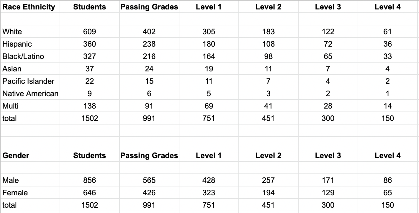
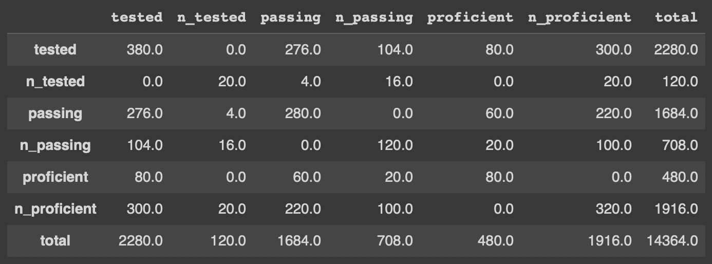
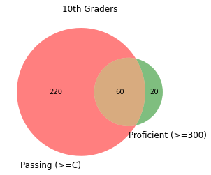
Examination of the data using a contingency table is interesting, but a picture is worth a thousand words and that is where a Venn Diagram can be useful.


Table 1


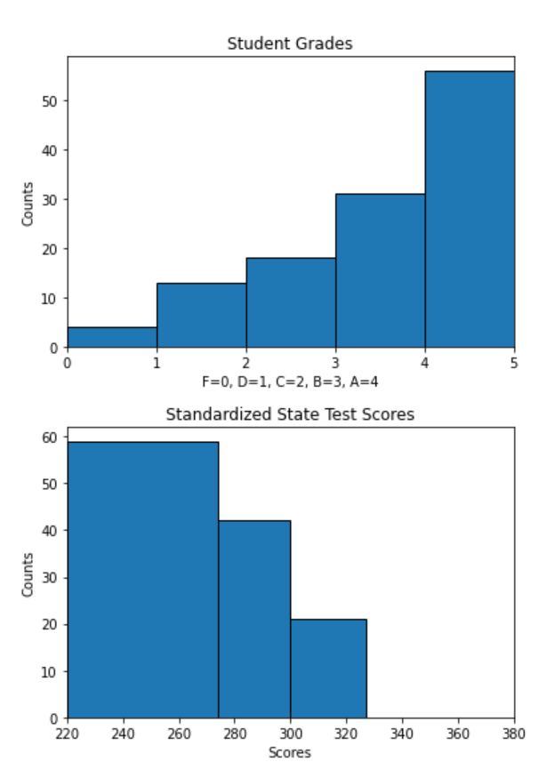
Graphing the weighted Venn Diagram based on the contingency table created questions and inspired further investigation into the relationship between grades and test scores. How are teachers grading students? Are grades a reflection of students’ knowledge of the material and mastery of skills? Why is the number of students passing district math classes so much larger than the number of students testing proficient by state standards? Why are about one fourth of the students testing proficient not passing math classes?


Figure 1

Target Audience and user/customer

The target audience of this product is school administrators and educators who are interested in gauging the performance and effectiveness of teachers and students in their schools. Currently, schools analyze their data using various static spreadsheet reports. These reports determine interventions for both students and teachers.

Users should have an interactive, dynamic report and visualization to see correlations between standardized test scores and teacher-graded assessments, as well as comparisons of grade distributions for different teachers and different student demographic groups. This will allow for a thorough analysis of teacher grading rigor and its impact, as well as provide actionable steps to improve teacher and student performance.


Table 2


Figure 2

Data

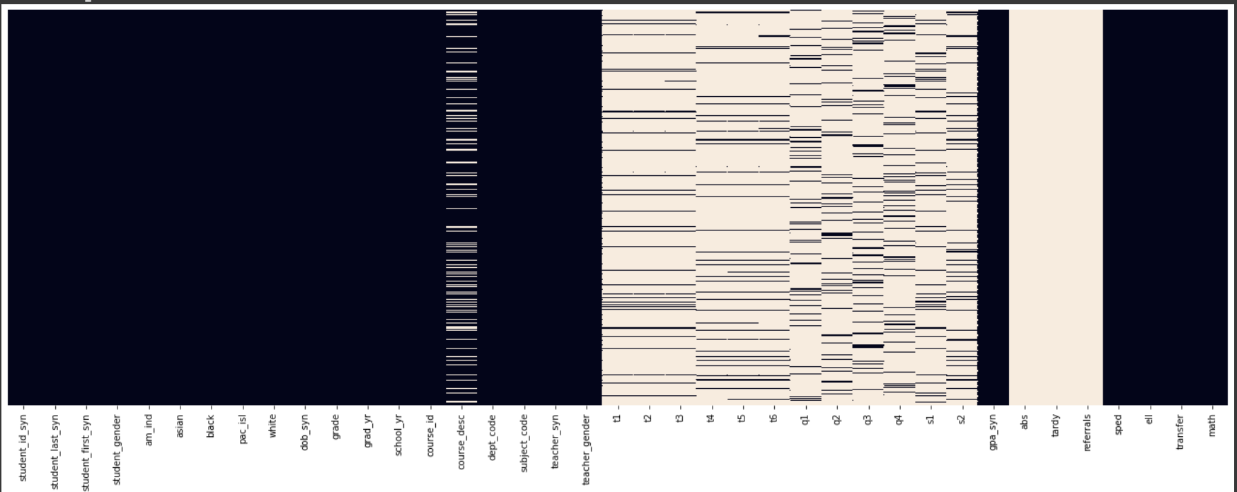
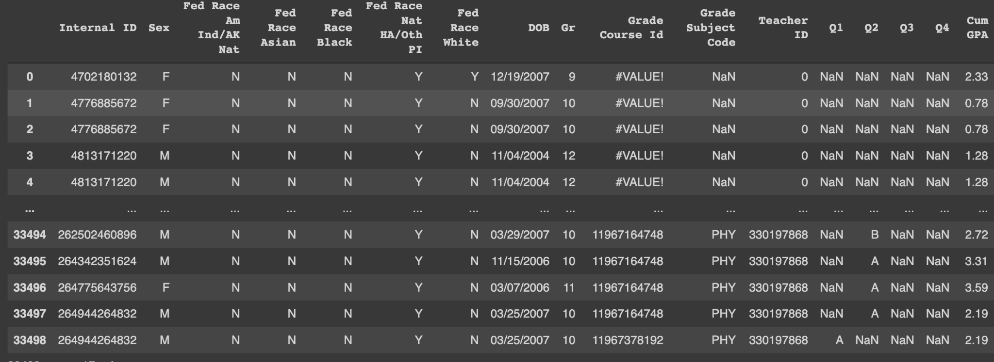
For this project we will be looking at synthetic records consisting of 4-years of data for 9th - 12th grade students in high school.

This data will include teacher and student id’s, along with school year, courses, ethnicity, gender, grades,and standardized state test scores. For this research project, we want to provide instructional quantitative feedback for teachers in order to increase student performance. Thus the creation of novel metrics were developed to determine teacher performance using the rigor score equation and the earth mover distance (EMD) for different distributions.

Exploratory Data Analysis


Novel Metrics


From the EDA the team decided to design two novel metrics:

Differences in Distributions Metric - determine if there are unique characteristics of the teachers or the students in each quadrant. Use Earth Mover’s Distance (EMD) to quantify differences in learning outcomes.

Rigor Metric - determine if there is a relationship between GPA and standardized test scores for the school. Use correlation and additional data to group teachers into quadrants.


Figure 7

Assumptions


These metrics are based on two major assumptions. The first is that the students will give their best efforts both in class and during the standardized testing. Further testing and analysis should be done to validate this assumption in the future.

The other assumption being made is that the State’s standardized tests are well designed to avoid the addition of any additional variance in the model.

Differences in distributions


To see the disparity between grading distributions we apply Wasserstein Metric also known as Earth Mover Distance (EMD). EMD looks at Minimum amount of work needed to transform signature x into signature y.

"Informally, if two distributions are interpreted as two different ways of piling up a certain amount of earth (dirt) over the region D, the EMD is the minimum cost of turning one pile into the other; where the cost is assumed to be the amount of dirt moved times the distance by which it is moved." (Wikipedia, emphasis added)


Formula 1

Earth Mover Distance has been practically used to show the differences in grade distributions (see Kretschmann, Jan (2020), "Earth Mover's Distance Between Grade Distribution Data with Fixed Mean" Theses and Dissertations. 2542). Here we will be using the EMD to show the difference between grades as well as standardized test scores, while also applying the metric to different groupings of teachers and demographic groups to reveal underlying inequities in learning outcomes.

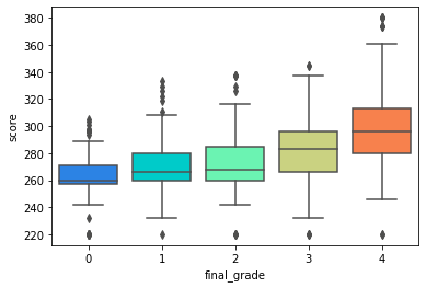
EMD values between distributions at the scale of our data can range from 0.0, where the distributions are completely identical, to 80.0, where they are as different as possible. In official results, standardized test scores are separated into four “levels”. For the sake of being able to compare them directly to classroom grades, we grouped raw standardized test scores into five levels that correspond to letter grades. Here is a table of grades and the standardized test scores that correspond to each grade. In the visualizations below, both the grade and score will be listed for reference regardless of which of them you choose to focus on.


Table 3


There are two components to the visualization of our EMD data. The first is a matrix of blocks that show the EMDs between different groups. Select a group to explore from four options: teachers, courses, student races, or student genders. Then, select which grading metric to use as a basis for the comparison. A matrix of blocks will show the EMD between each group in the block where they intersect. By default, you will see data for all school years between 2019-2022. If you want to focus on a single year in that range, you can click on the slider or buttons under “School Year” to adjust the year. If the matrix remains blank after you make a selection, that means there is no data for that year. (Note: There is no standardized testing data for 2019.)

To see a comparison between the final grades and standardized test scores within a group, select “cross-comparison” on the metric menu. The EMDs between each group’s final grades and the same group’s test scores will appear along the diagonal of the matrix.

You can also choose to see EMDs between actual data and reference distributions. The available reference distributions are:
- C/300 Average, available for final grades or test scores
- District Average, available for standardized test scores only
- State Average, available for standardized test scores only

If you click on a block in the matrix, a bar graph will appear below it. Each distribution is plotted in a different color, and the height of the bar represents the percentage of students in the group that received the corresponding grade or test score. The space between the two distributions, or the amount of overlap, shows the EMD between them.

Both of these visualizations are also available at an additional level of detail. If you would like to see more specific breakdowns of a single group - for example, the EMDs between grade distributions for boys and girls in Algebra 1 - you can do so by selecting the “Prefiltered EMD” option on the left of your screen. From there, you can choose a group and an ID to focus on (i.e. “Group by: Course”, “Break down this group: Algebra 1”), as well as an additional variable to break the selected ID down by (“By this variable: Student Gender”).

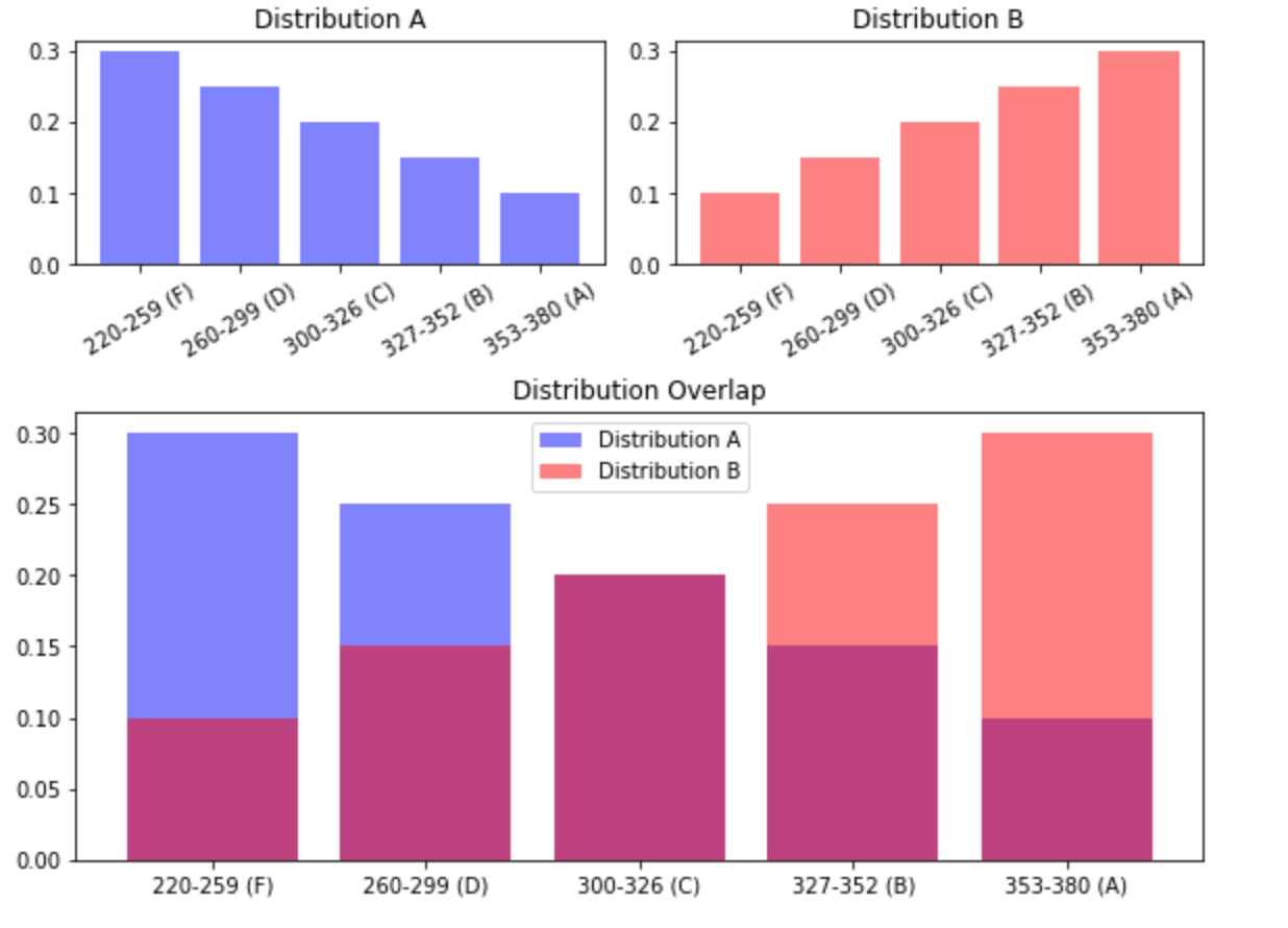
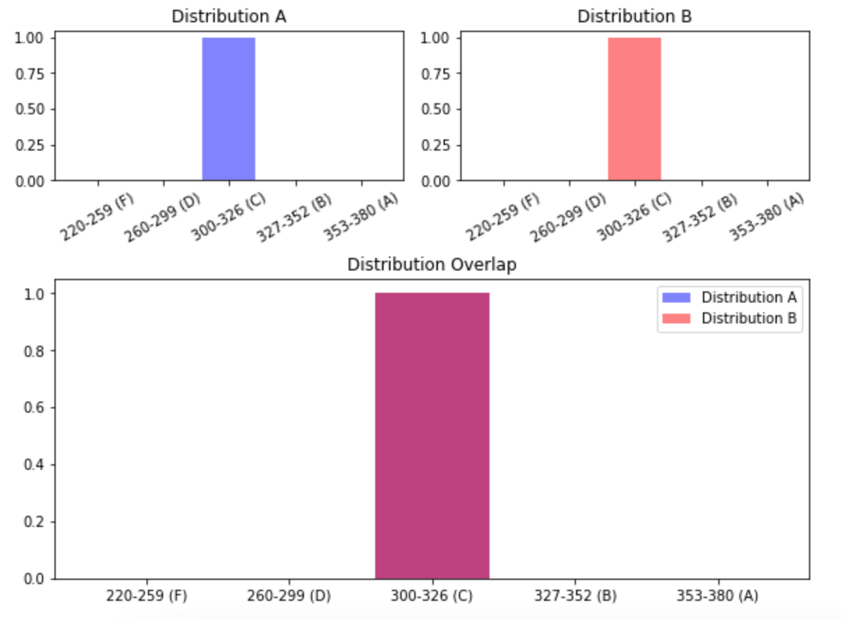
Below are examples of some possible distributions, plotted as orange and purple bars, and how they overlap when plotted together. Where the distributions overlap, the bars appear dark red. Generally speaking, the more dark red appears in a graph, the lower the EMD is between those two distributions. This is because if distributions are more similar to begin with, less effort would be required to make them identical. In the final visualization, the bars will be blue and red, and overlapping regions will appear purple.


Differences in Distributions Explainer


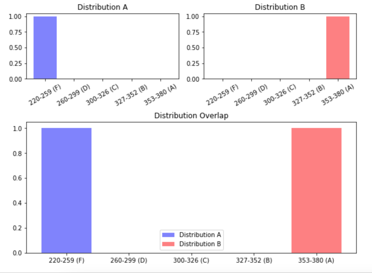
Example 1: Maximum distance
EMD: 80.0

These distributions are as different as possible.


Figure 8


Figure 9

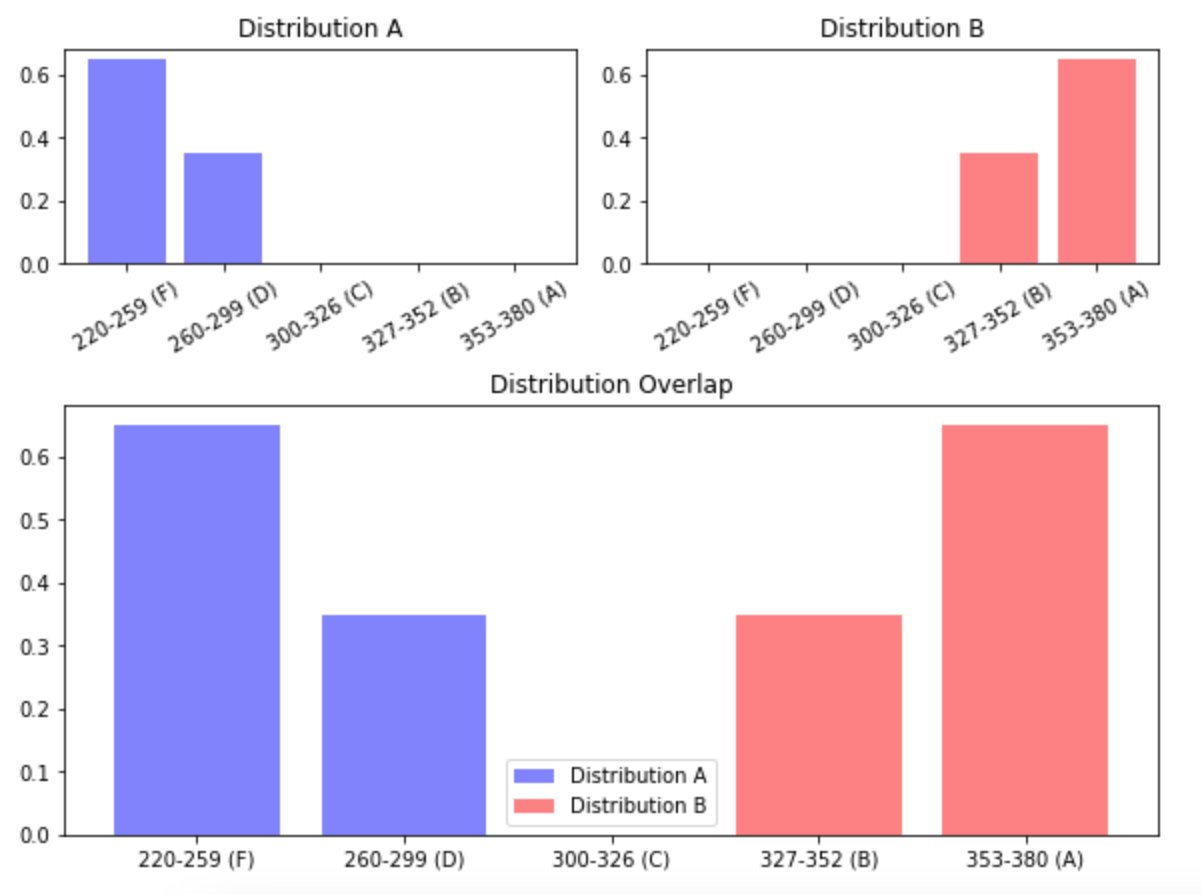
Example 2: No overlap
EMD: 66.0

These distributions have a slightly lower EMD, since they both have a portion that is closer to the other.

Example 3: Some overlap
EMD: 20.0

Since these distributions overlap more, they have a lower EMD.


Figure 10


Figure 11

Example 4: Identical distributions
EMD: 0.0

If the distributions completely overlap, there is no distance between them, so the EMD is zero.

Interactive Dashboard Differences in distributions:
Single-level EMD and Pre-filtered EMD


Actionable Insights Differences in Distributions


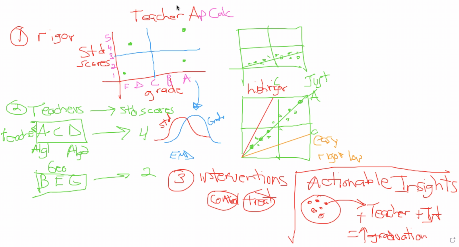
The essence of this project is finding a way to gauge teacher grading rigor. The EMD tool allows us to do that by comparing teachers’ grading distributions to the distribution of their students’ standardized test scores. If a teacher is grading rigorously, students who are unprepared for standardized testing should receive lower grades in their classes. If the grades a teacher gives in class actually reflect their students’ preparedness and performance on standardized tests, their distributions of grades and test scores will be quite similar and have only a small EMD between them. We can test these cross-metric distances for individual teachers using the EMD tool using the “Cross-comparison” metric option in the “Single-level EMD” tab.

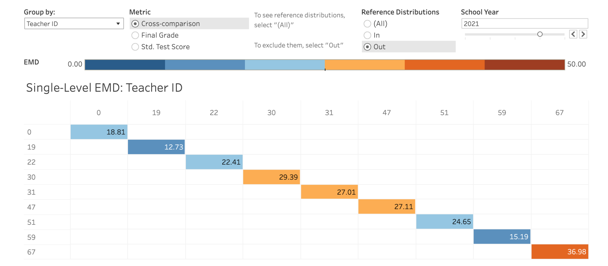
The visualization below shows the Earth Mover Distance between the distribution of final grades and the distribution of test scores for each teacher in the 2021 school year. I chose to exclude reference distributions from this view because comparing a C/300 average to itself will always yield an EMD of zero.


Figure 12


This view can teach us a few things. Most importantly, many of these numbers are in the top half of the range of EMDs in our data. That means that across all the comparisons we can make using this tool, comparing a teacher’s own grades to the test scores their students receive yields some of the highest EMDs possible. That doesn’t paint a good picture for grading rigor at this school.

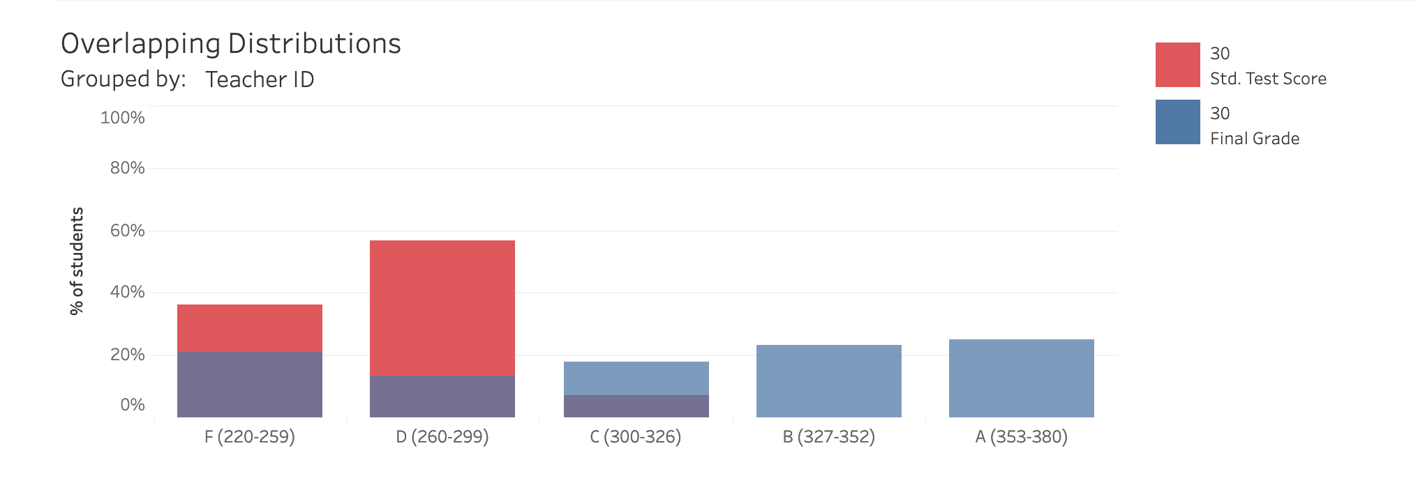
Let’s dive a little deeper and look at Teacher 30 specifically, who has one of the highest cross-metric EMD in this view. By clicking on the block that shows Teacher 30’s EMD in the matrix above, I can see the distributions of grades and test scores that are responsible for that EMD.


Figure 13


These distributions are, as expected, fairly different. The blue bars are of a fairly even height across the graph, meaning that Teacher 30 tends to assign around 20% of students their each letter grade. The red bars, on the other hand, are higher on the left side of the graph, revealing that those same students received failing grades on their 2021 standardized tests. The purple areas over C, D, and F grading regions signify areas where the two distributions overlap. In other words, Teacher 30 does give some students F’s and D’s on their final grades, but not nearly as many as would be appropriate if students’ final grades reflected their standardized test scores.

Overlapping distributions that look like this are a sign of grade inflation, which happens when a teacher rewards students with higher grades than their learning would actually reflect. If Teacher 30’s final grades reflected their students’ actual progress in learning the course material, the final grades would likely be much lower.

Since each one of these distributions is made up of individual students, it is worth investigating if any particular groups of students are disproportionately impacted by Teacher 30’s lack of grading rigor. To do this, we can use the prefiltered EMD tab to examine in more detail the breakdown of grades and standardized test scores within classes taught by Teacher 30.

To do this, I move to the “Prefiltered-EMD” tab and choose to group by Teacher ID, then break down Teacher 30’s information by Student Gender. Since all of the data in this project comes from math classes and there is a dominant cultural narrative that girls are less naturally skilled at math than boys, examining differences in performance between male and female students is a reasonable place to start.


Figure 14


This view shows that the distributions of final grades between male and female students of Teacher 30 have an EMD of 9.295. Examining the overlapping distributions shows that this distance exists because male students tend to receive higher final grades than their female counterparts. Does that better performance in class translate to standardized test scores? If it did, I would expect to see a similar EMD between standardized test scores for these groups. To see if that is the case, I can change the metric to “Std. Test Scores” and keep all other settings the same.


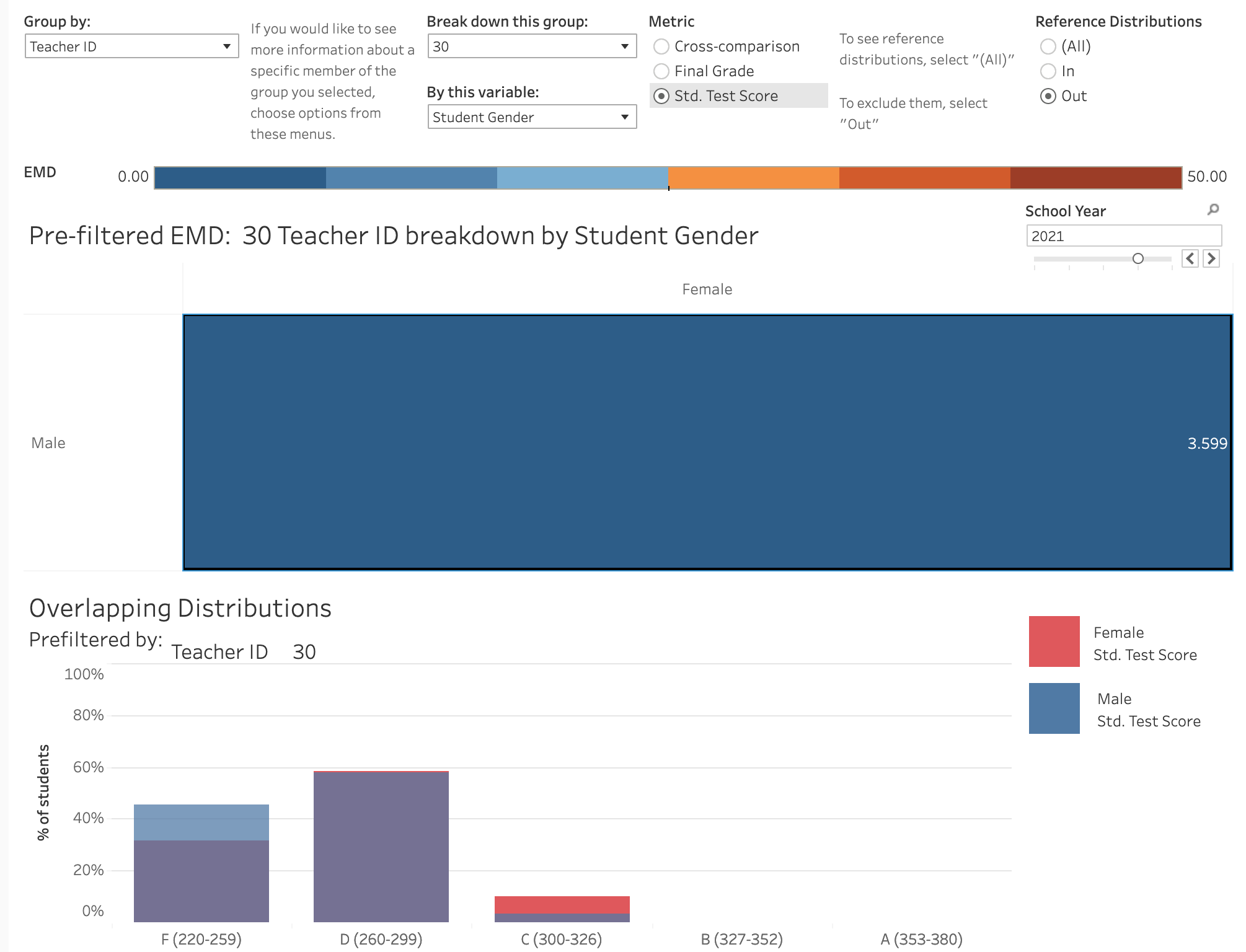
Figure 15


The distance between distributions of test scores for male and female students of Teacher 30 is not the same, but smaller than the distance between distributions of final grades - this means that students perform relatively similarly on standardized testing, even though their final grades would suggest male students have a better grasp of the material than females. In fact, females actually perform slightly better on standardized testing than males, despite receiving lower final grades. For a final view of this discrepancy in grading, I can view the cross-metric EMD for these groups by changing the metric to “cross-comparison” and keeping all other settings the same


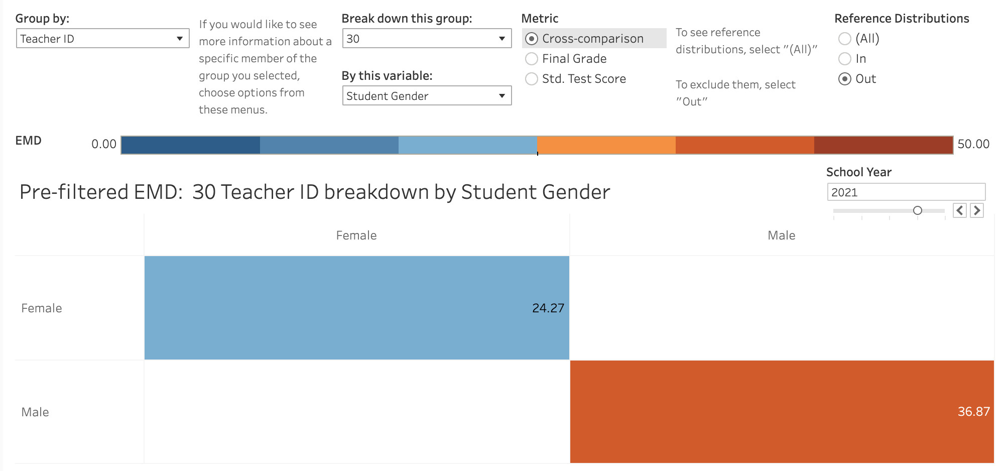
Figure 16


This view confirms that there is a bigger distance between the distributions of final grades and test scores for males than there is for females. In other words, male students’ performance in class differs more from their performance on standardized tests. The previous views looking at each of those distributions individually let us know that this is because male students receive higher grades from Teacher 10, despite performing the same as their female counterparts on standardized tests. Female students have a lower EMD for this cross-comparison because their lower final grades more closely resemble their performance on standardized testing.

This analysis revealed that during the 2021 school year, Teacher 30 graded less rigorously than many of their colleagues. It also revealed that male students benefited the most from Teacher 30’s grade inflation habit. This information could inform an intervention in Teacher 30’s classes, from the introduction of a grading rubric to ensure that all students are reliably graded relative to their mastery of the subject, to targeting more attention to female students to get their grades up. In the future, the effectiveness of any changes can be gauged by comparing the EMDs in this analysis to those of future school years for the same groups - Can Teacher 30 reassess their grading or teaching strategies to get students’ grades in line with their standardized test performance?
Rigor Metric


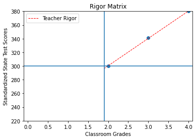
The rigor metric’s value proposition is that it provides an opportunity for administrators to evaluate their schools’ performance using a metric - teacher grading rigor - that has not been explicitly defined before. School funding is often determined by standardized test performance and student success (final grades), so quantifying a measure of how those two factors interact on a school-level scale can provide a valuable insight for administrators as well as for individual teachers, giving them the opportunity to increase their students’ and their school’s performance. Thus, the rigor metric utilizes two factors to determine the results: the correlation coefficient (CC) of grading and scores and the ratio of students achieving a C or better in class and proficiency on the state assessment (Qualifying Students) and the total number of students converted from a decimal to a percent.


Formula 2

Rigor = (CC ) * (Qualifying Students/Total Students) * 100


Correlation coefficient is the covariance of the two variables divided by the product of their standard deviations. The form of the definition involves a "product moment", that is, the mean (the first moment about the origin) of the product of the mean-adjusted random variables; hence the modifier product-moment in the name.” (Wikipedia, emphasis added)


Formula 3


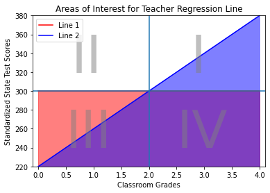
The Rigor Metric visualizes well as a quadrant analysis and also produces a score to quantify instructional rigor. Quadrants 1 and 3 are expected with grades with class grades corresponding to test scores. While students falling in quadrants 2 and 4 is an unexpected result and thus needing further analysis is necessary.

Rigor Metric Explainer


- The main feature of the Rigor Matrix is a scatterplot showing teacher rigor at a number of different levels of analysis. Users can choose between various levels of analysis and aggregation to uncover different insights. Available levels of analysis, aggregation, additional encodings, and potential insights are described below.

- Users choose exactly one level of analysis and exactly one level of aggregation per dashboard created. The level of aggregation determines what each data point represents (i.e. a student, a teacher, a department, or a school).

- The user is presented with additional encodings to include more information in the dashboard, including student demographics and other variables not selected as aggregators. These choices update plots of rigor and bias, which will show clusters of student performances across the four quadrants and the demographics of students in those clusters.

- In addition to the scatter plot presented, the users are presented with a table of scores. The table shows the percentage of students in each quadrant. The “Rigor Score” and the “Correlation Coefficient”. Please see examples below.


Figure 17


Here are some key points to keep in mind when thinking about the Rigor Score:

1. How well does the teacher’s grades align with the mastery of skills as represented by the State’s standardized test results? This is done through calculating the correlation coefficient for grades vs scores (CC). The focus is on consistently grading students based on their level of knowledge in mastering skills.

2. Are students performing well both in class and on the standardized test? Calculate the percentage of students in Quadrant 1 which represents students with a C or above in class and showing proficiency on the State’s standardized test (QS/Total Students). Once consistency in grading is achieved, the next step is to help lift more and more students to mastery.

3. Normalize the Rigor Score by converting the decimal to percent by multiplying by 100.

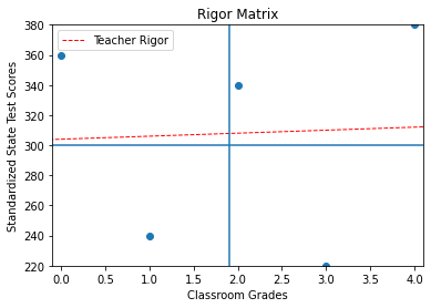
4. In the future, more factors could be added. One such factor is the ratio of the value of the regression line when the grade is 4 with a max value equal to the maximum possible test score and the maximum possible test score (Reg(4,max=380)/380). The other factor is the R squared value which ranges from 0 to 1 and corresponds to the percentage of variation in scores that is accounted for by its regression on grades. These factors are currently not included in the Rigor Score calculation in order for a simpler explanation for teachers.

The following are examples of what may be observed in the wild with Rigor Scores ranging from 0 to 100.

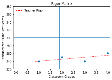
Example #1: There is no correlation between grades.

The correlation is low or zero and the qualifying student percent is low, therefore resulting in a low Rigor Score.

CC = 0.04, QS/Total = 0.40, (0.04)(0.40) = 0.016 and then converted from a decimal to a percent to get the Rigor Score = (0.016)(100) = 1.6 and this teacher is not rigorous.

This teacher is inconsistent with grading and it is unclear if teacher instruction has any effect on student achievement based on test results. First steps would be to help this teacher create a rubric for grading and improve their consistency, thereby increasing their correlation coefficient (CC) and increasing their Rigor Score (RS).


Figure 18


Figure 19

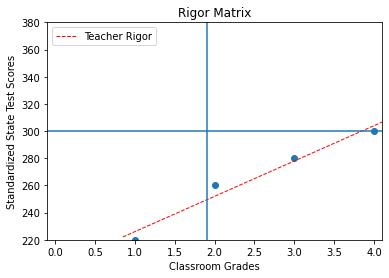
Example #2: High positive correlation, but no Qualifying Students (QS).

No Qualifying Students (QS) will always result in a Rigor Score = 0 regardless of the correlation. A teacher must have at least one Qualifying Student to receive a Rigor Score > 0.

CC = 0.67, QS/Total = 0.0, (0.67)(0.0) = 0.0 and then converted from a decimal to a percent to get the Rigor Score = (0.0)(100) = 0.0 and this teacher is not rigorous.

The discussion with this teacher might be that their grading seems to be somewhat consistent across grades, showing a positive correlation, and a suggestion might be to ask what the teacher could do to improve student achievement. This will increase the number of Qualifying Students which will then increase their Rigor Score (RS).

Example #3: High correlation with a low number of Qualifying Students.

Grades are consistent with high positive correlation, but a low number of Qualify Students results in a low Rigor Score.

CC = 0.98, QS/Total = 0.25, (0.98)(0.25) = 0.245 and then converted from a decimal to a percent to get the Rigor Score = (0.245)(100) = 24.5 and this teacher is not rigorous.

Grading is consistent with a high positive correlation, now lets ask the teacher what they can do to increase student performance to increase QS and increase their Rigor Score.


Figure 20


Figure 21

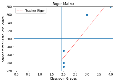
Example #4: This is what grade inflation might look like.

No students have low grades, but test scores show a majority of students with poor performance.

CC = 0.93, QS/Total = 0.40, (0.93)(0.40) = 0.372 and then converted from a decimal to a percent to get the Rigor Score = (0.372)(100) = 37.2 and this teacher is not rigorous.

Review the grading rubric with the teacher stressing that the grades are not informing the students upon their level of knowledge and mastery of the skills. Ask the teacher for suggestions to bring the grading more in line.

Example #5: High correlation with a high number of qualifying students.

CC = 0.97, QS/Total = 0.75, (0.97)(0.75) = 0.728 and then converted from a decimal to a percent to get the Rigor Score = (0.738)(100) = 72.8 and this teacher is rigorous.

Once the grading is consistently showing a high positive correlation and the teacher moves more students up the line to increase the number of qualifying students, more time can be spent focusing on interventions for students in quadrant 3.


Figure 22


Figure 23

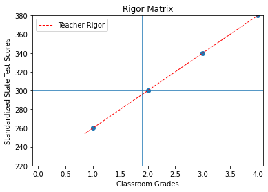
Example #6: High correlation and all qualifying students.

This is a rigorous teacher. Grades are consistent and all students are doing well in class on the test bringing this Rigor Score close to 100.

Interactive Dashboard Rigor Metric


Actionable Insights Rigor Metric


Let’s examine two different teacher’s data and interpret the Rigor Metric for each. The first teacher had the lowest rigor score in our data set and the second had the highest.


Figure 24


When you filter teacher 64, school year "2020" and "alg1" course by clicking them in the dashboard, there seems to be a large amount of variance within each grade causing a low correlation coefficient and there are only two students who are considered “Qualifying Students”. Low correlation and low qualifying student percentage means a low Rigor Score.

Grading seems reasonable for students receiving C’s (2) and D’s (1) with most students closer to the green Rigor trend line, however, students on the upper and lower end of the scale are farther from the Rigor trend line. This teacher is not rigorous and requires an intervention.

Remembering that there are two areas of focus using the Rigor Matrix, one, consistent grading with a high positive correlation and two, increase the number of qualifying students that are successful in both class and testing. Grading is easier to approach by utilizing a grading rubric that can be district, school, and/or teacher designed. This will allow the teacher to grade more consistently. Next would be to begin discussing how to improve the teacher’s practice to increase the students’ level of knowledge in mastering skills.

As shown on the result in the image above:

Total Students = 55
q1=2, q2=0, q3=18, q4=35
q1 %=3.64%
Correlation coefficient =0.415
Rigor score 1.51 = (CC)(QS/Total Students)(100)=(0.415)(2/55)(100) *

As a second example, when we filter teacher 59, school years “2020” and “2021” and, “alg2”, “alg2/alg3” and “above” courses by clicking them in the dashboard, again there is a large variance in the scores of each grade creating a low correlation coefficient, but there is a large amount of “Qualifying Students”. While many more students fall closer to the green Rigor trend line, grades are much less consistent on the extremes. This teacher is more rigorous than the first as shown below.


Figure 25


Making sure a teacher is utilizing a grading rubric is step one in creating consistent grading with a high positive correlation. While we would expect a majority of students in Quadrant 1 and 3, it is interesting to ponder about those students outside farther from the Rigor trend line in Quadrants 2 and 4. For the students in Quadrant 2, why did they receive such a low grade (D=1) and yet scored as well as students with higher grades? What about those students in Quadrant 4, they received some of the highest grades in class, but were some of the lowest performers on the standardized tests? These will make excellent talking points with the teacher to reflect upon.

Total Students =41
q1=33, q2=2, q3=1, q4=5
q1 %=80.49%
Correlation coefficient = 0.414
Rigor score = 33.30 = (CC)(QS/Total Students)(100)=(0.414)(33/41)(100) *


*Final results may vary since not all decimals are shown.

Conclusion


A clear understanding of students’ performance and mastery of skills depends on the teachers’ rigor in grading and can be measured using the relation between students’ grades and standardized test scores. Are schools measuring how teachers are grading in a consistent and standardized way? Is it possible to identify any biases that may have an effect? This set of tools allows schools to compare objectively the different grading styles between teachers, different outcomes for students, and different trends in courses. In this way, you are empowered to better target interventions to improve students’ performance and track how teachers improve instructional rigor over time in an objective manner.